Client Details
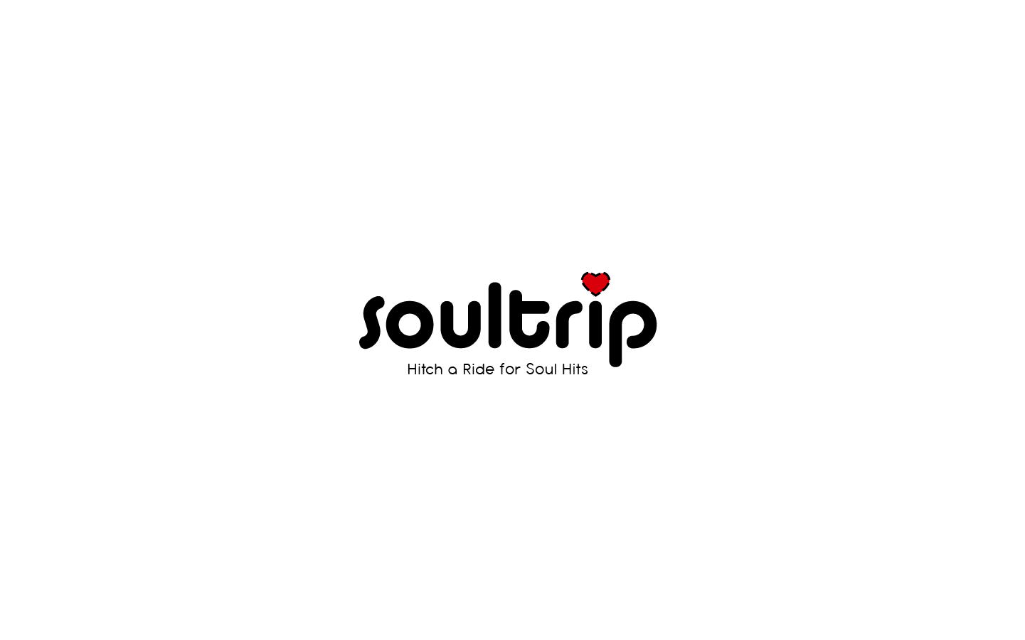
Soultrip is "middle Tennessee's premier soul cover band", whose goal is to take their listeners down memory lane with rock soul music of the past. Instead of lounge aesthetics, Soultrip infuses horns and backing vocals to add some flair.
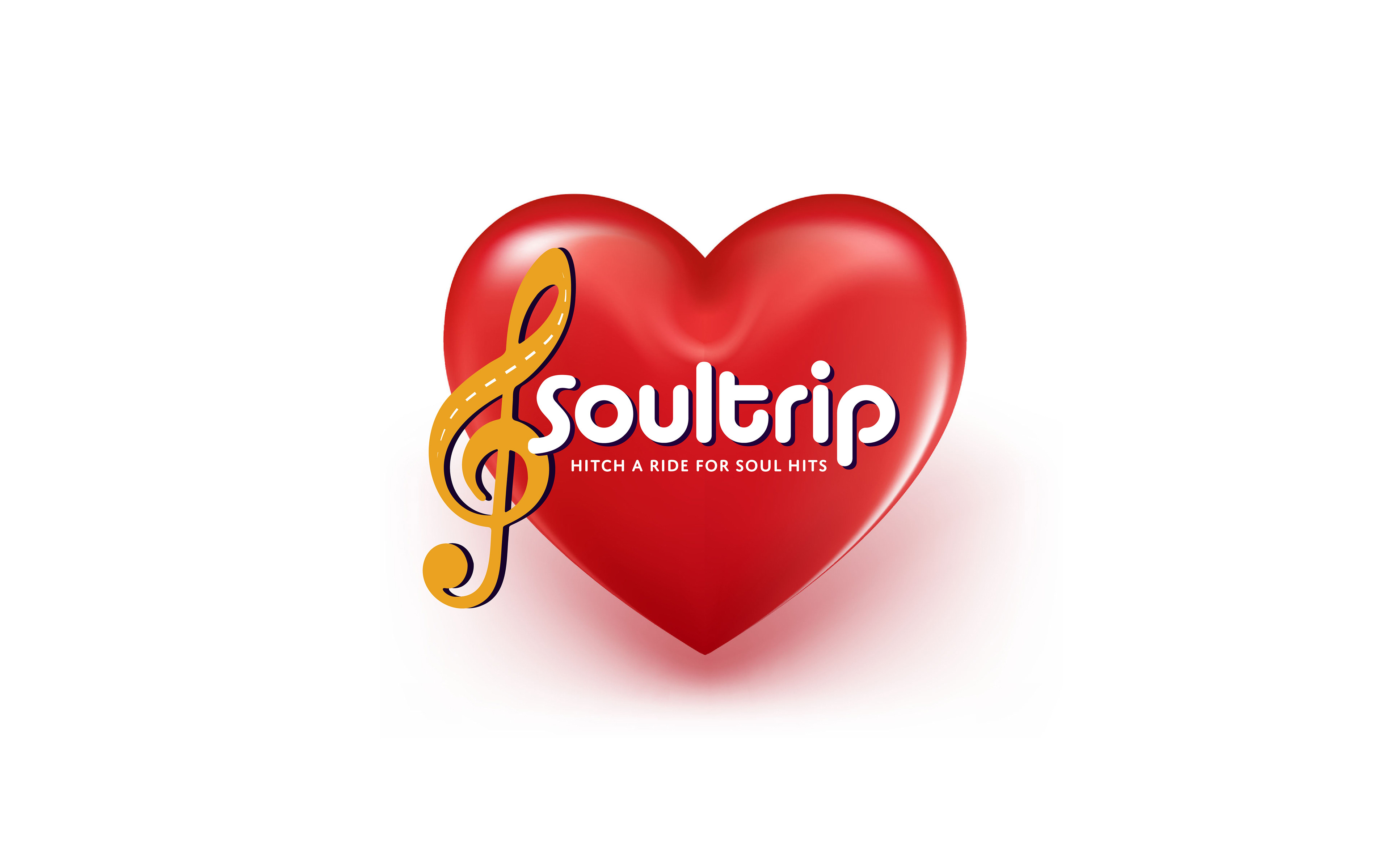
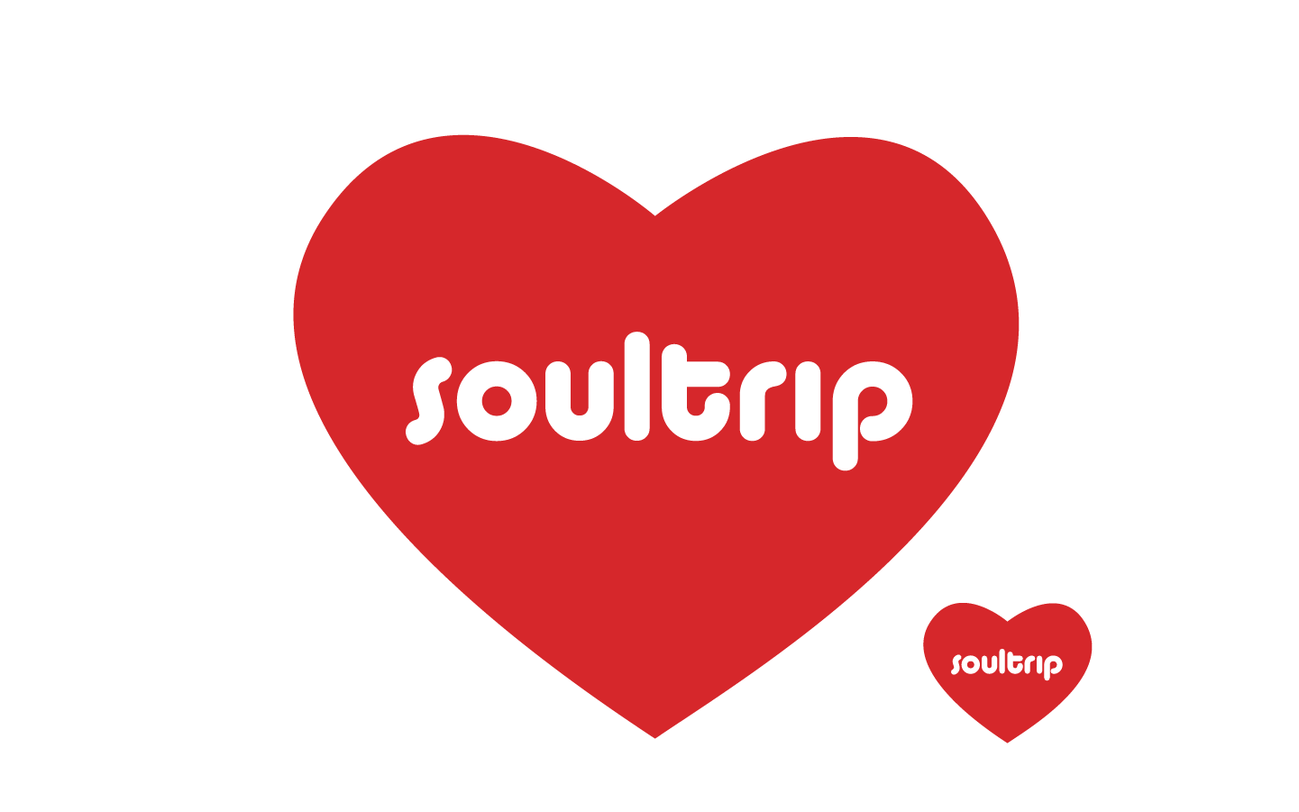
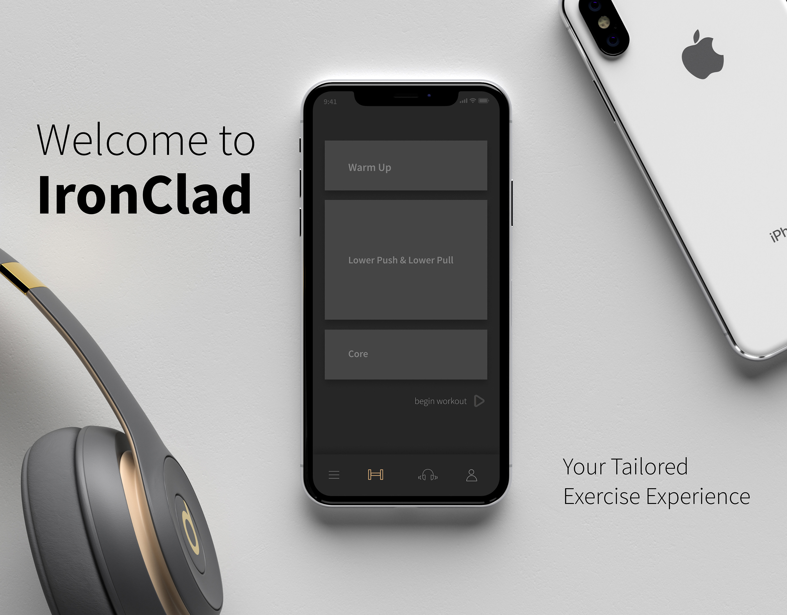
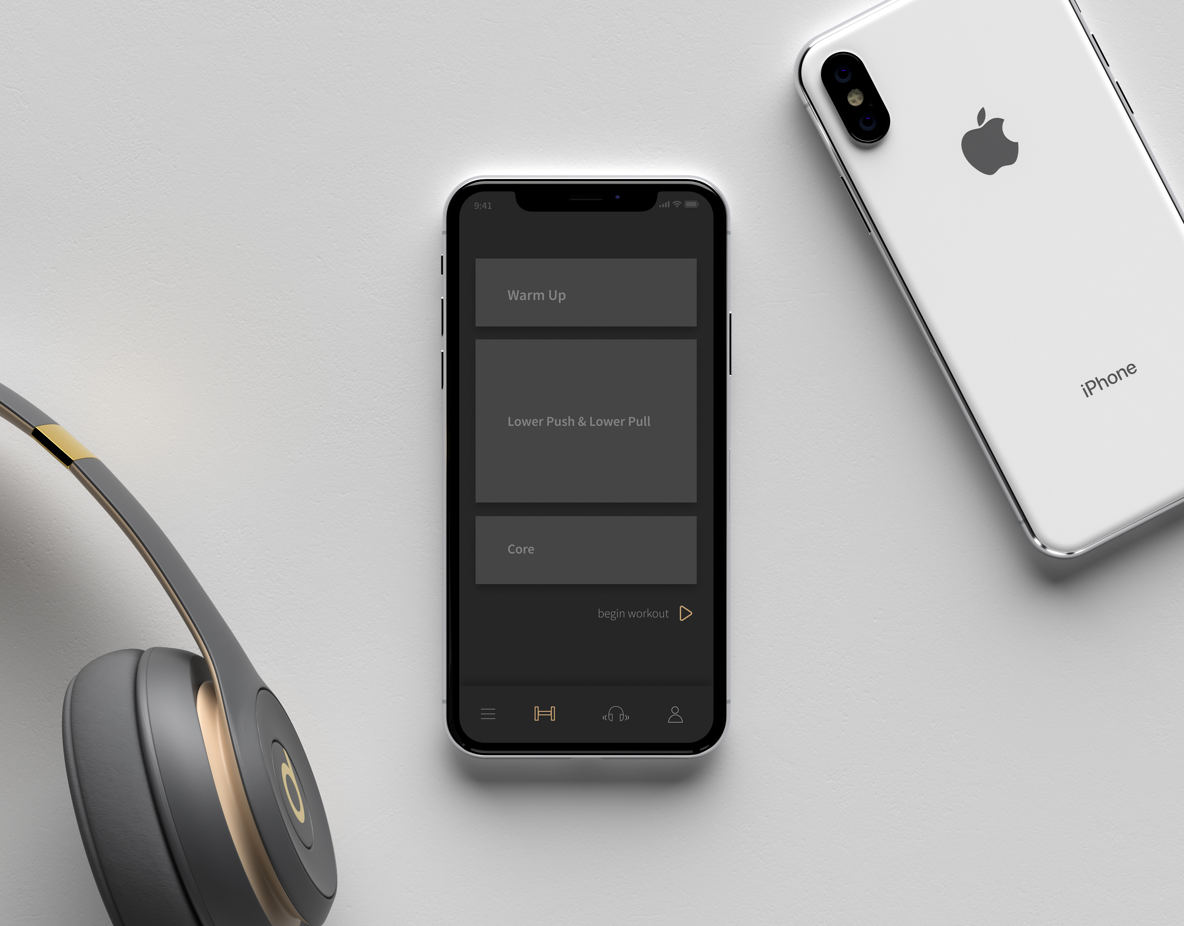
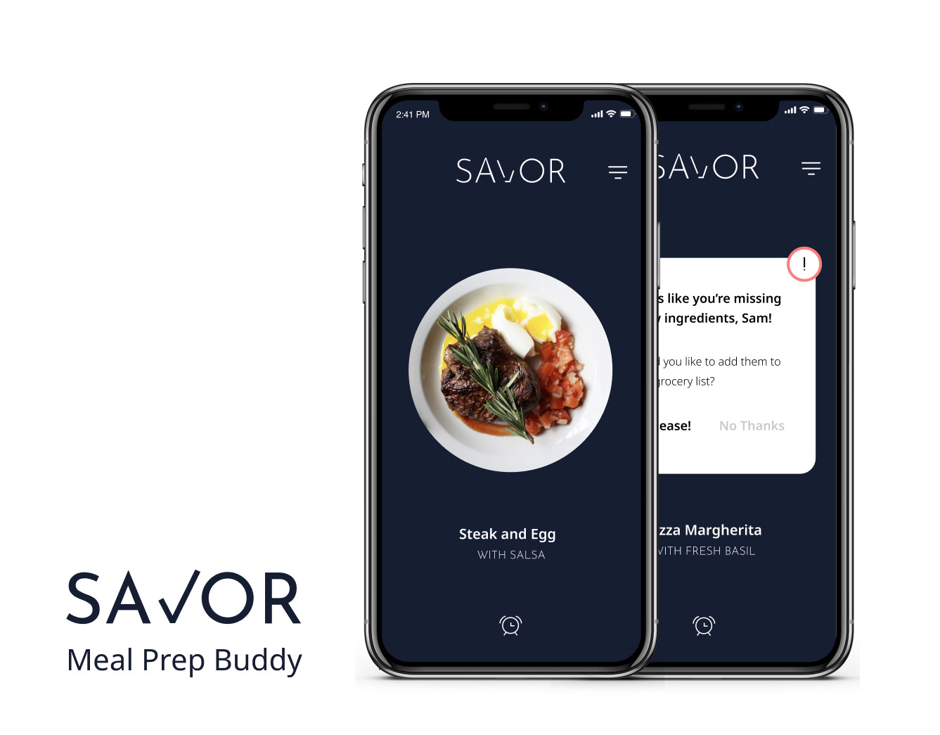
The client requested an editable, perfect replica, of this logo he tossed together in Microsoft Word. It needed to work on a 24x36ft banner that would hang behind the band, various pieces of merchandise, and a website.
Final Designs
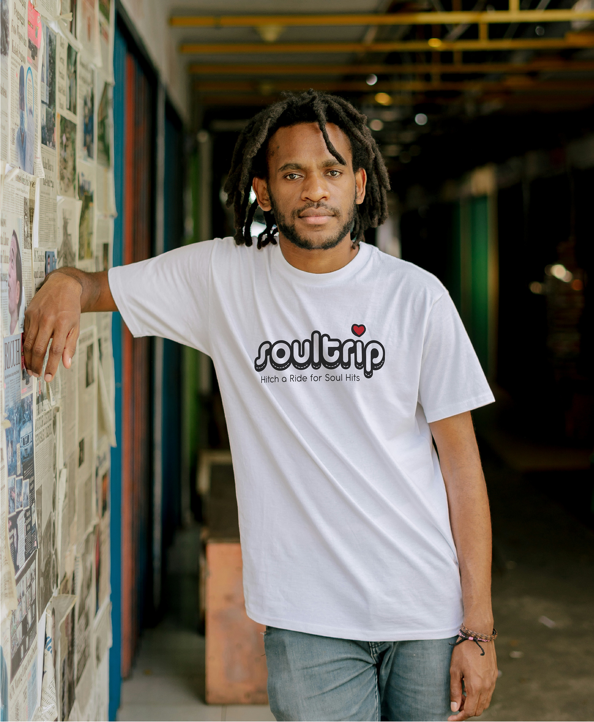
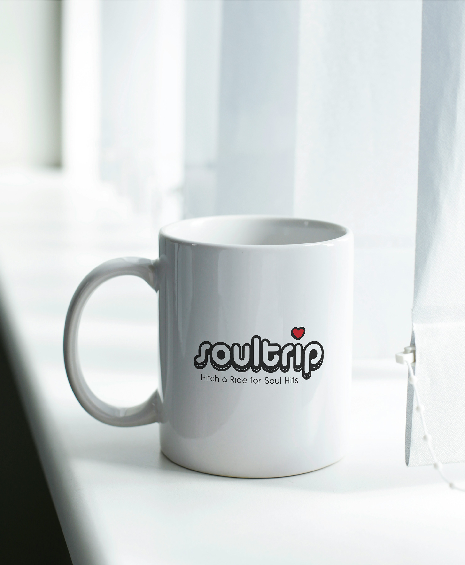

Final design for merchandise, banners, posters, and their website.

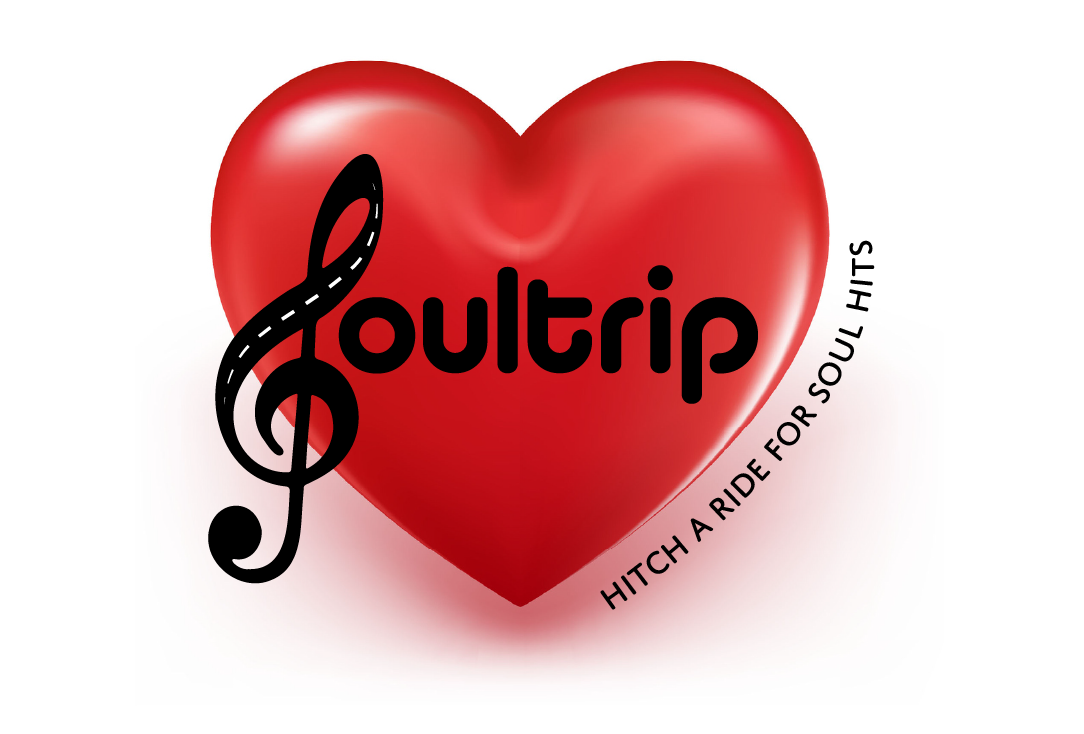
Email signature
Rationale
The client was really looking for his logo to not feel so corporate, but instead relaxed, playful, and welcoming. He wanted the new logo to be reminiscent of the original design, so I made sure to keep the original typeface with its rounded uniform letters. I added in a strong drop shadow to ensure it'd hold up well on a larger-than-life banner that would span the width of whatever stage he stepped foot on.
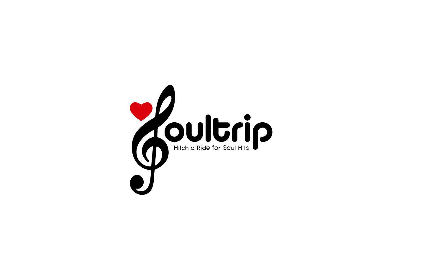
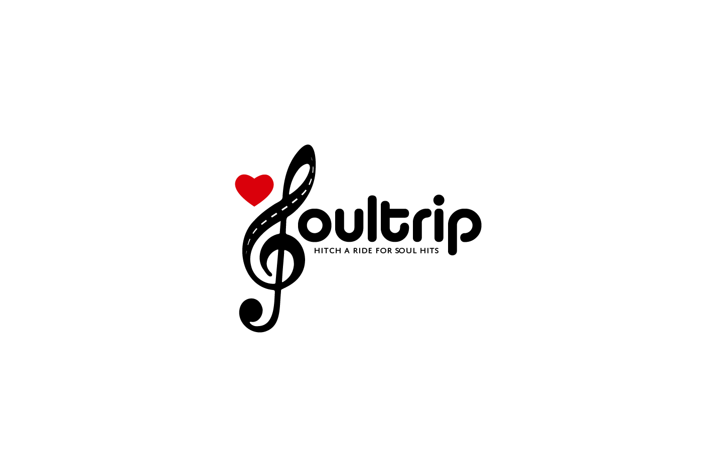
When talking about his band, you could really tell how much he loved the music he played, and how much the music from his youth meant to him. He told a story about taking a long trip with a home made playlist with the sun on his face and the wind in his hair that resonated with me. I love a good homemade mixtape. To bring this into the design, I reused the heart concept from the original, design and streamlined its' look to be more cohesive with the graphic lettering. I then brought in the dashed lines to represent the lines in a road.
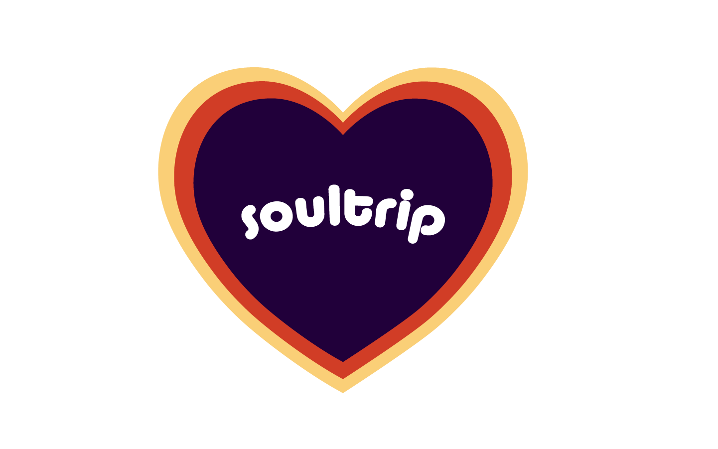
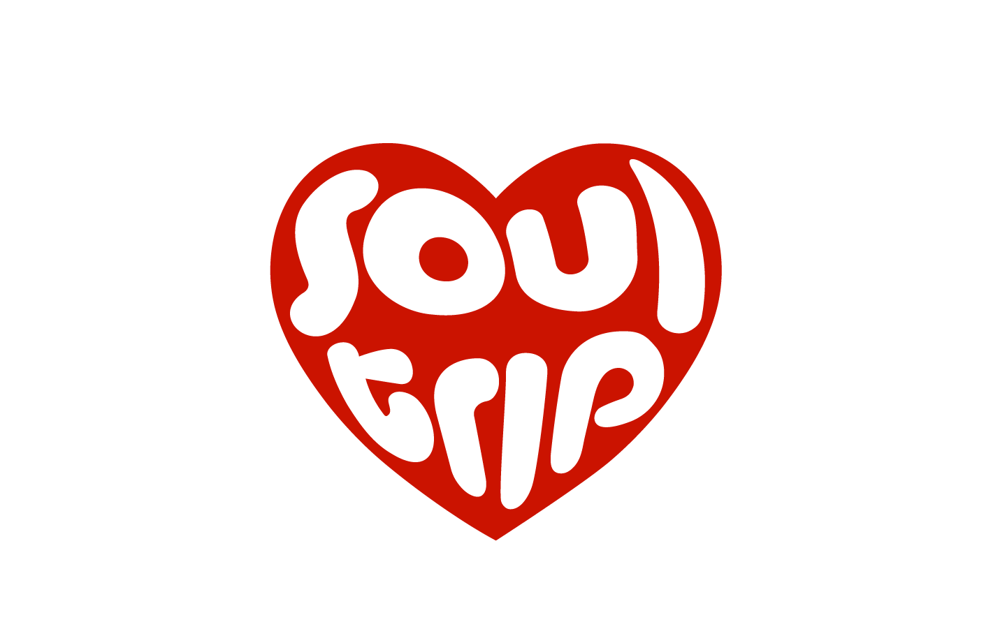
Logo Exploration
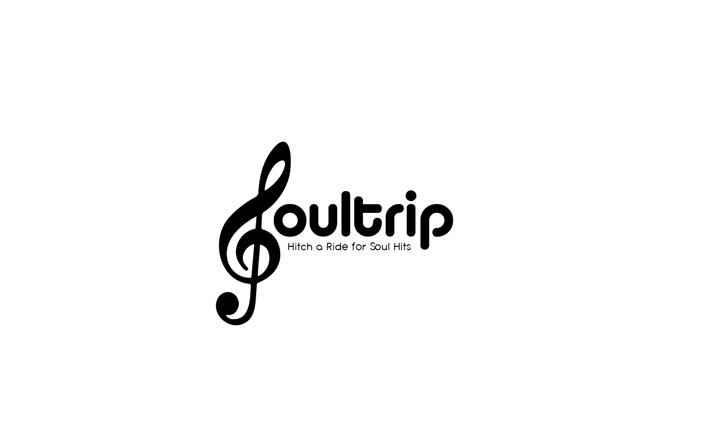
After translating the clients original logo in Illustrator to a perfect replica, they encouraged me to try a few additional approaches. The goal was to keep the playful essence, the heart, and the idea of motion from the original logo, but enhance it in a clean and legible way.